
Design Portfolio
&
Services
Book Cover Design
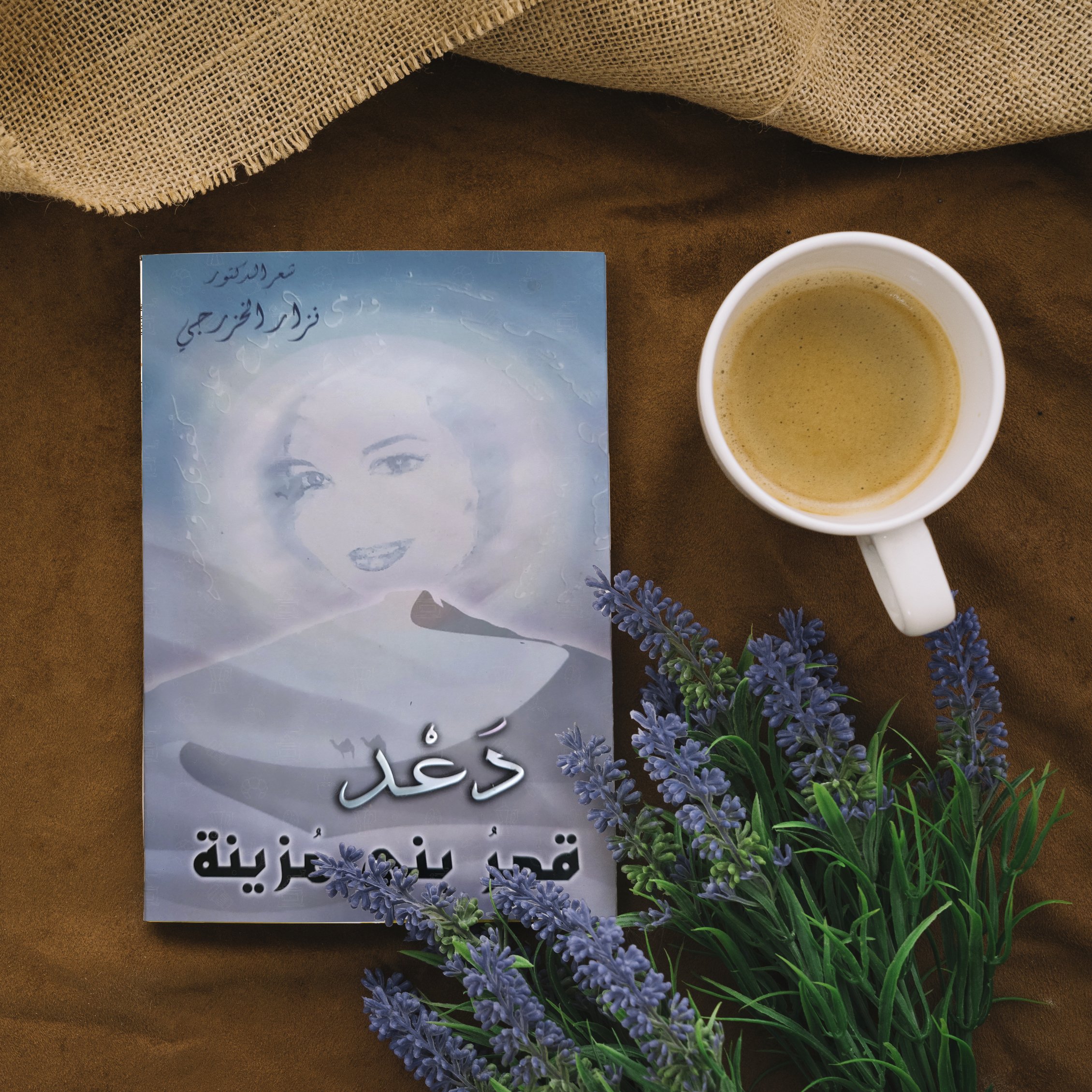
Project: Poetry Book Cover
Client’s Name: Nizar Al-Khazragy
My journey as a graphic designer took a transformative turn with my very first project—a book cover design for an Arabic poetry book. This project served as my grand entrance into the world of graphic design, and it remains a cherished milestone in my career.
To bring this book cover to life, I embarked on a creative process deeply intertwined with the essence of the poetry it embraced. I started by painting the face of the woman who inspired the poems within the book. This initial stroke of the brush became the foundation upon which the entire design would flourish.
Drawing inspiration from the love poems dedicated to this remarkable woman, I immersed myself in the rich and evocative atmosphere described within the pages. The words of the poetry enveloped me, guiding my creative choices and infusing the design with the essence of Arabic culture and romance.
Booklet Design
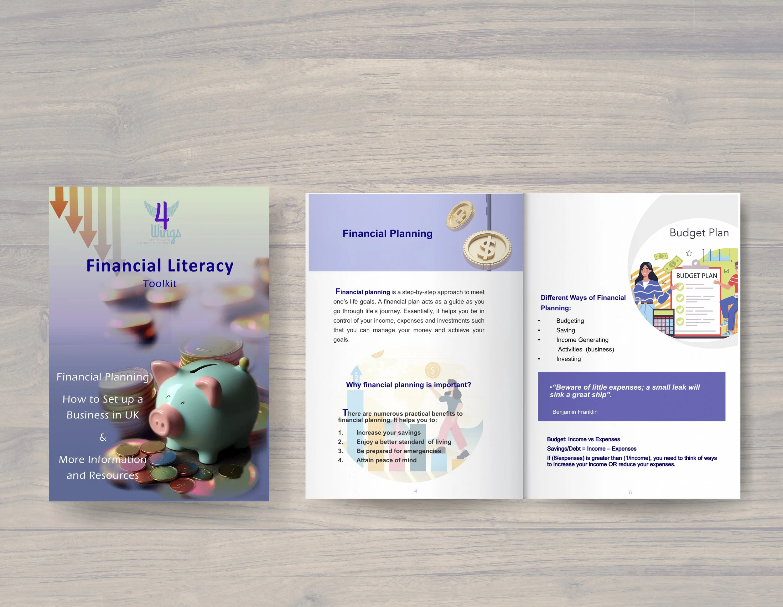
The design process for the booklet on Financial Literacy, developed for the participants of the course delivered by 4Wings, was driven by a deep understanding of the target audience. With the participants being refugee and asylum seekers women, it was essential to create a design that catered to their unique needs and circumstances, taking into account their financial and mental status.
To ensure that the booklet was accessible and user-friendly, I focused on simplicity and clarity throughout the design. The information contained within the booklet needed to be easily understandable and readily accessible to empower the participants in their financial lives.
First and foremost, I prioritised a clean and uncluttered design aesthetic. I chose a minimalistic approach, using ample white space and clear typography to enhance readability. This allowed the participants to focus on the content without any distractions, enabling them to absorb and comprehend the information more effectively.
Additionally, I carefully considered the visual hierarchy of the booklet. I structured the layout in a logical and intuitive manner, ensuring that important information was prominently displayed and easy to locate. By using consistent headers, subheadings, and bullet points, I facilitated quick scanning and navigation through the content.
In terms of colour scheme, I opted for a soothing and harmonious palette to create a calm and inviting atmosphere. I chose colours and graphics that resonated with the participants’ cultural background and preferences, fostering a sense of familiarity and comfort. Furthermore, I made sure to maintain sufficient colour contrast to aid readability, particularly for those with visual impairments.
Restaurant Menu
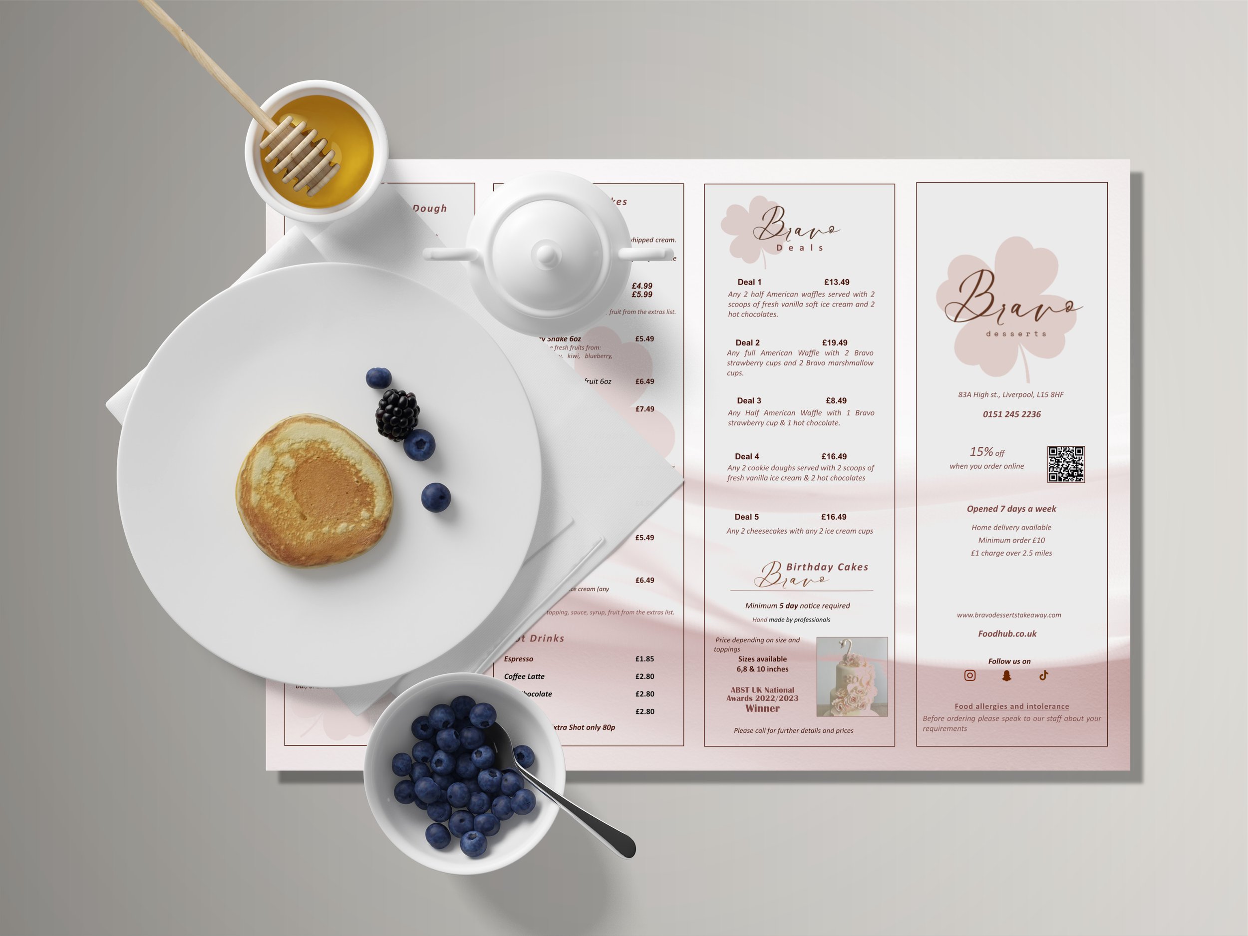
Project: Dessert Menu Design
Client’s Name: Bravo Dessert
Design Concept:
Design concept revolves around clean lines, minimalistic elements, and a soft, pastel colour scheme dominated by blushed pink hues. I aimed to create a visual narrative that evokes a sense of indulgence and refinement, enticing customers to explore the array of tantalising desserts available at Bravo Dessert.
Colour Palette:
The colour palette for the Bravo Dessert menu predominantly features blushed pink as the primary hue, symbolising femininity, elegance, and sophistication.
Typography:
For typography, i opted for elegant and legible typefaces that complement the overall aesthetic of the menu. Using serif and fonts was selected to ensure that the menu remains both visually engaging and easy to read.
Layout and Composition:
The minimalist approach to layout enhances the menu’s elegance, making it both visually appealing and user-friendly.
In conclusion, the design portfolio for Bravo Dessert’s menu encapsulates the essence of simplicity and elegance, as per the client’s request. Through careful consideration of colour, typography, layout, and composition, with its refined aesthetic and sophisticated charm, the Bravo Dessert menu serves as a fitting reflection of the brand’s commitment to excellence and culinary artistry.
Brochure Design
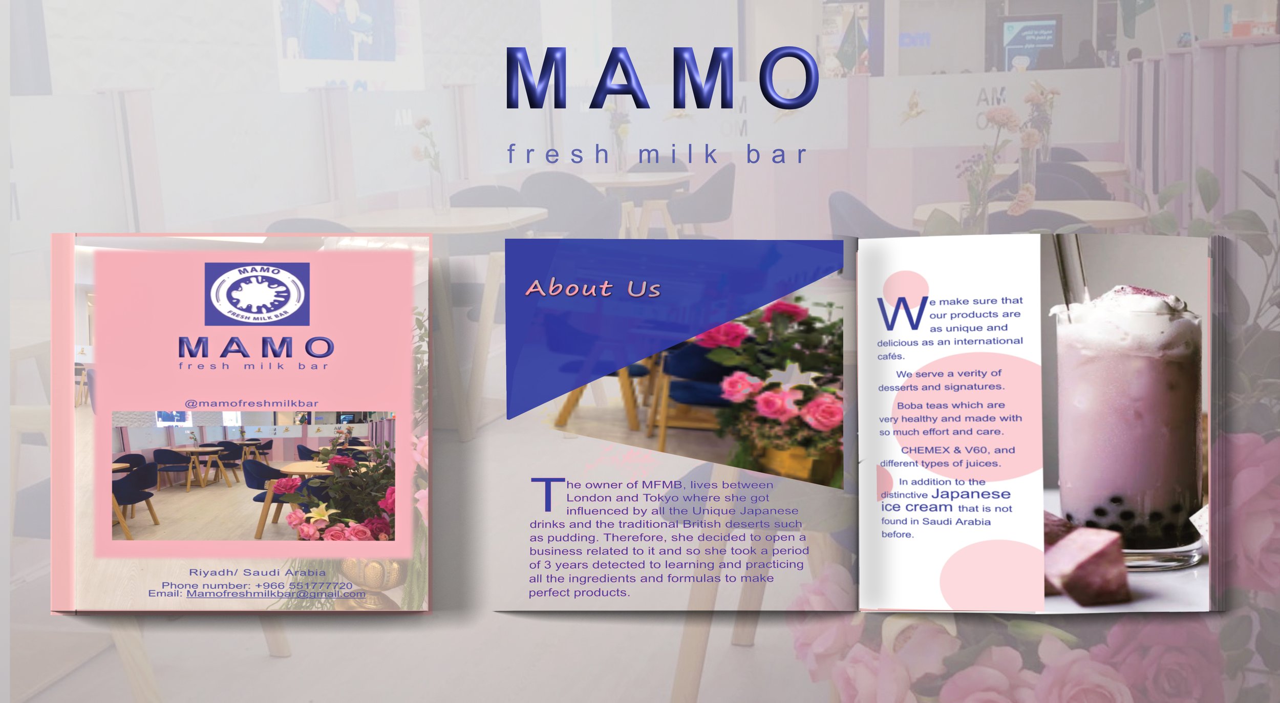
Project: Brochure Design
Client: Mamo Fresh Milkbar
This project involved designing a brochure for Mamo Fresh Milk Bar, a popular fresh milkshake bar located in Riadh, Saudi Arabia. The brochure aimed to promote the bar and showcase its aesthetic aspects, emphasising its use of a consistent colour scheme inspired by the restaurant, logo, and milkshakes. The design was kept clean and easy to understand, with a focus on highlighting the range of milkshake offerings and creating visual appeal.
Overall, the brochure effectively communicated the brand’s identity and enticed customers to visit Mamo Fresh Milk Bar
Flyers
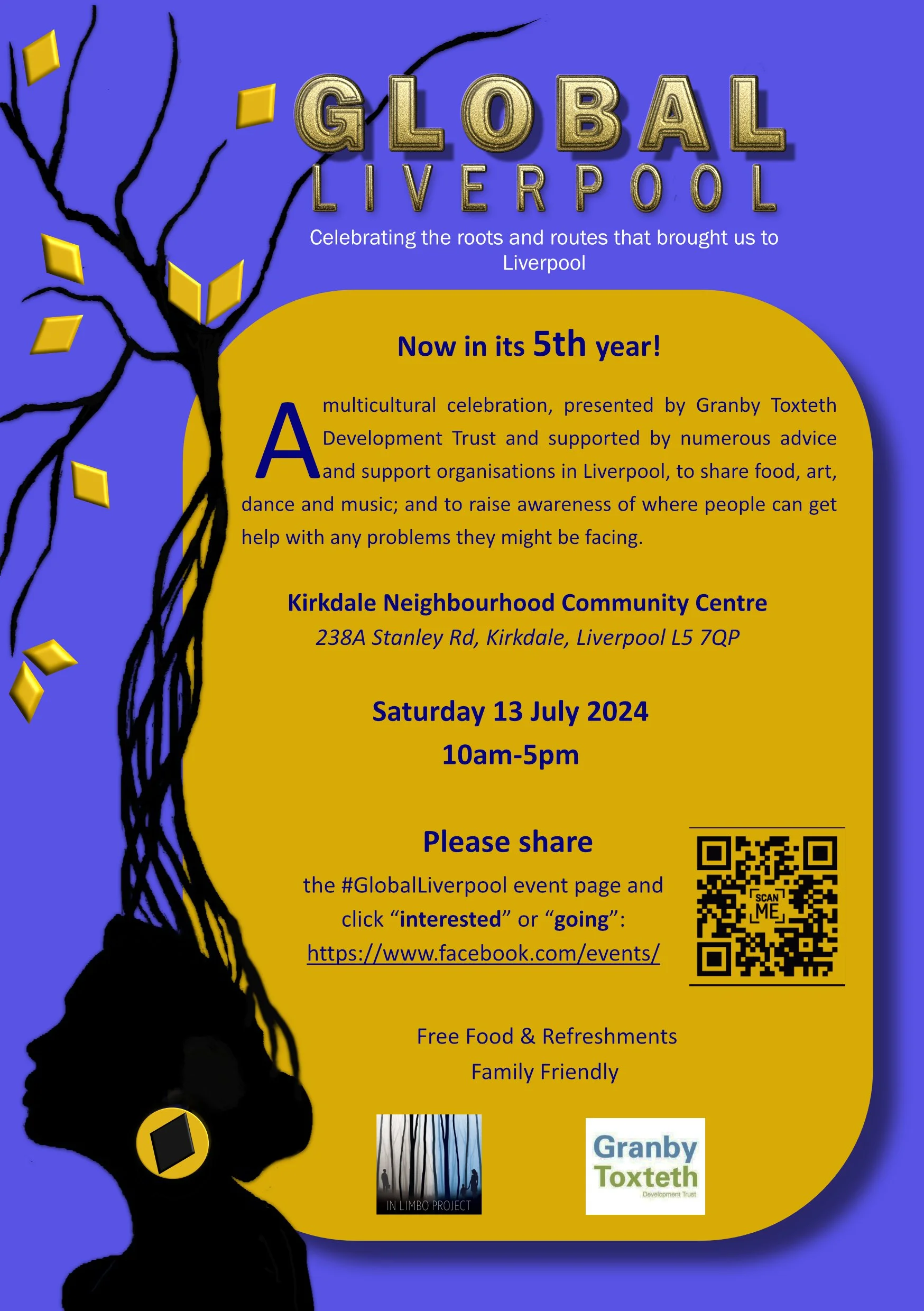
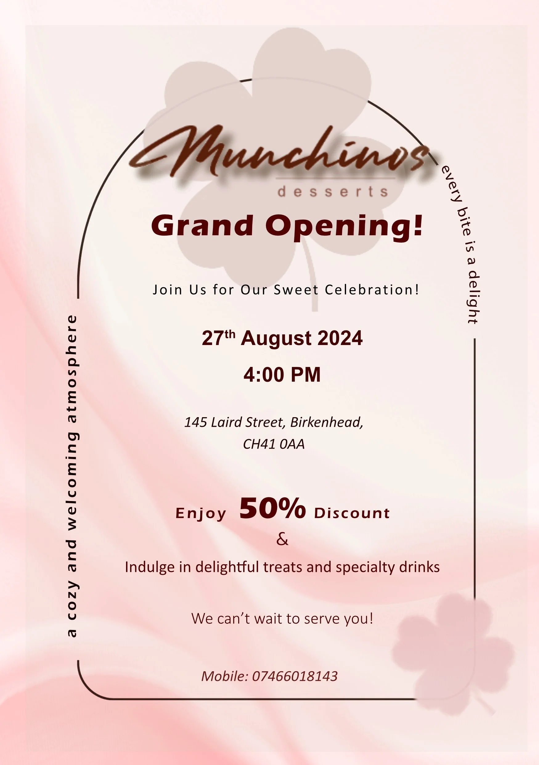

Over the course of my five years of work experience as a graphic designer, I had the opportunity to design various flyers for a multitude of projects. Each flyer served as a visual representation of the project it promoted, showcasing different aspects and capturing the essence of the endeavour. These flyers not only fulfilled their practical purpose of disseminating information but also became valuable pieces to showcase in my portfolio, illustrating the breadth and diversity of my design skills.
The process of designing flyers typically began with gathering information about the project’s objectives, target audience, and key messaging. Understanding these factors allowed me to create a design that effectively communicated the project’s essence and resonated with the intended recipients.
After settling on a direction, I would transition to the digital design phase. Utilising graphic design software, I would bring the chosen concept to life, carefully curating images, selecting appropriate fonts, and harmonising colours to create a cohesive visual composition. Balancing readability and aesthetics, I ensured that the flyer effectively conveyed the project’s key information while capturing attention and generating interest.
Throughout the years, the flyers I designed covered a broad range of projects, spanning from cultural events to community initiatives, and educational programs. Each flyer was meticulously crafted to highlight different aspects of the respective projects.
In conclusion, the process of designing flyers for various projects during my six years of work experience as a graphic designer involved understanding project objectives, brainstorming ideas, collaborating with stakeholders, and creating visually compelling compositions. The resulting flyers not only fulfilled their practical purpose but also became valuable assets for my portfolio, demonstrating my versatility and skill in translating concepts into engaging visual designs.
Poster and Logo Design
Project: VArt Project Poster Design
Client’s Name: 4Wings
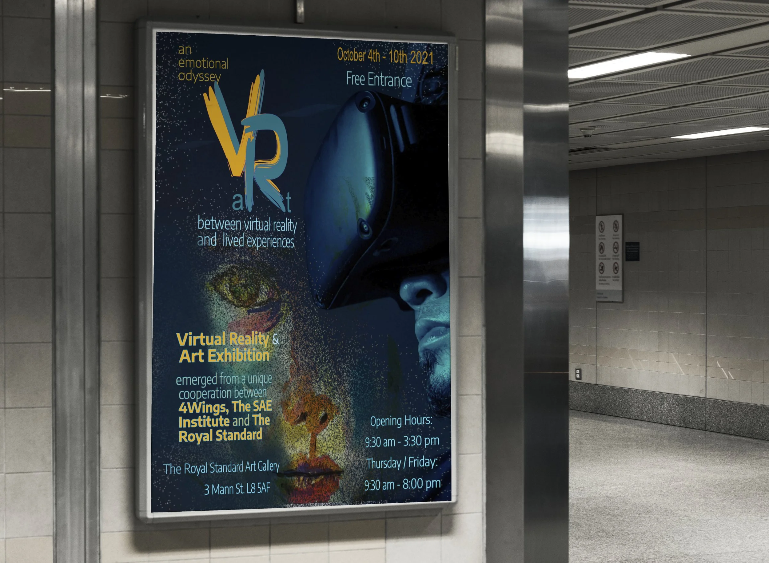
The VArt project, an exciting endeavour that combines the realms of Virtual and Art, sought to establish a distinct identity through its name, logo design, and poster/flyer creation. The project aimed to highlight the artistic aspects of the virtual world while embracing a futuristic aesthetic.women.
To capture the essence of the project, I carefully crafted the name by merging “Virtual” and “Art” into a seamless combination. This fusion not only reflected the project’s core concept but also conveyed the innovative and imaginative nature of the artworks to be showcased.
The logo design played a pivotal role in visually representing the union of virtual and art. By cleverly integrating elements from both realms, I created a distinctive symbol that encapsulated the project’s artistic essence. The logo served as a visual representation of the synergy between the digital and creative worlds, instantly evoking curiosity and intrigue
The poster and flyer design for the project aimed to capture the attention of the target audience and ignite their interest in the exhibition. Drawing inspiration from one of the captivating paintings to be exhibited, I created a visually stunning and captivating design. Infused with artistic and futuristic elements, the poster portrayed the uniqueness and allure of the VArt project.
Attendees and the audience alike were captivated by the visually striking poster and flyer, which effectively conveyed the artistic and innovative nature of the exhibition. The design not only generated interest but also garnered recognition to 4Wings projects.
Ultimately, the VArt project thrived in creating a cohesive identity through its name, logo design, and poster/flyer creation. The fusion of virtual and art in the project’s name and logo conveyed its innovative and imaginative nature, while the visually striking poster design resonated deeply with the audience, generating interest and recognition. The project’s ability to captivate and engage the art community was a testament to its unique and compelling visual identity.
Film Making and Video Editing
Project: Happy News Channel
Client’s Name: 4Wings
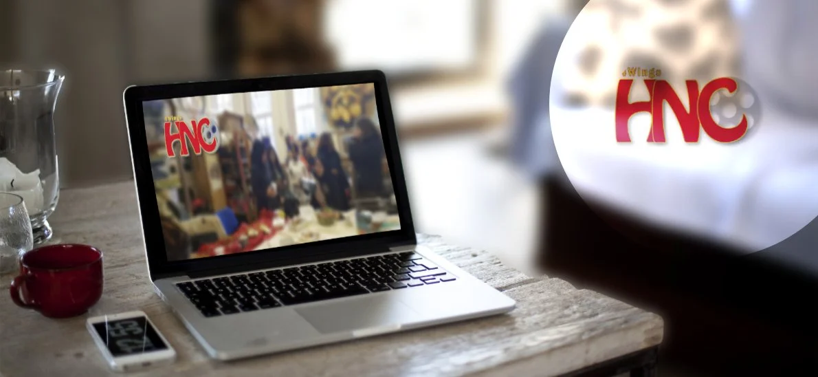
Another significant project I undertook was the creation of the Happy News Channel on YouTube. I not only designed the channel’s logo but also took charge of producing and editing videos that were subsequently published.
The aim of this project is to show and promote 4Wings different activities and to share the happy news of their participants.
This endeavour allowed me to apply my design skills in a multimedia context, further expanding my repertoire and strengthening my expertise in video editing.
In addition to editing other videos on 4Wings YouTube channel, including the series of videos during the lock down, 31 Days of Self Love video series, Sunday Sentiment videos and others.
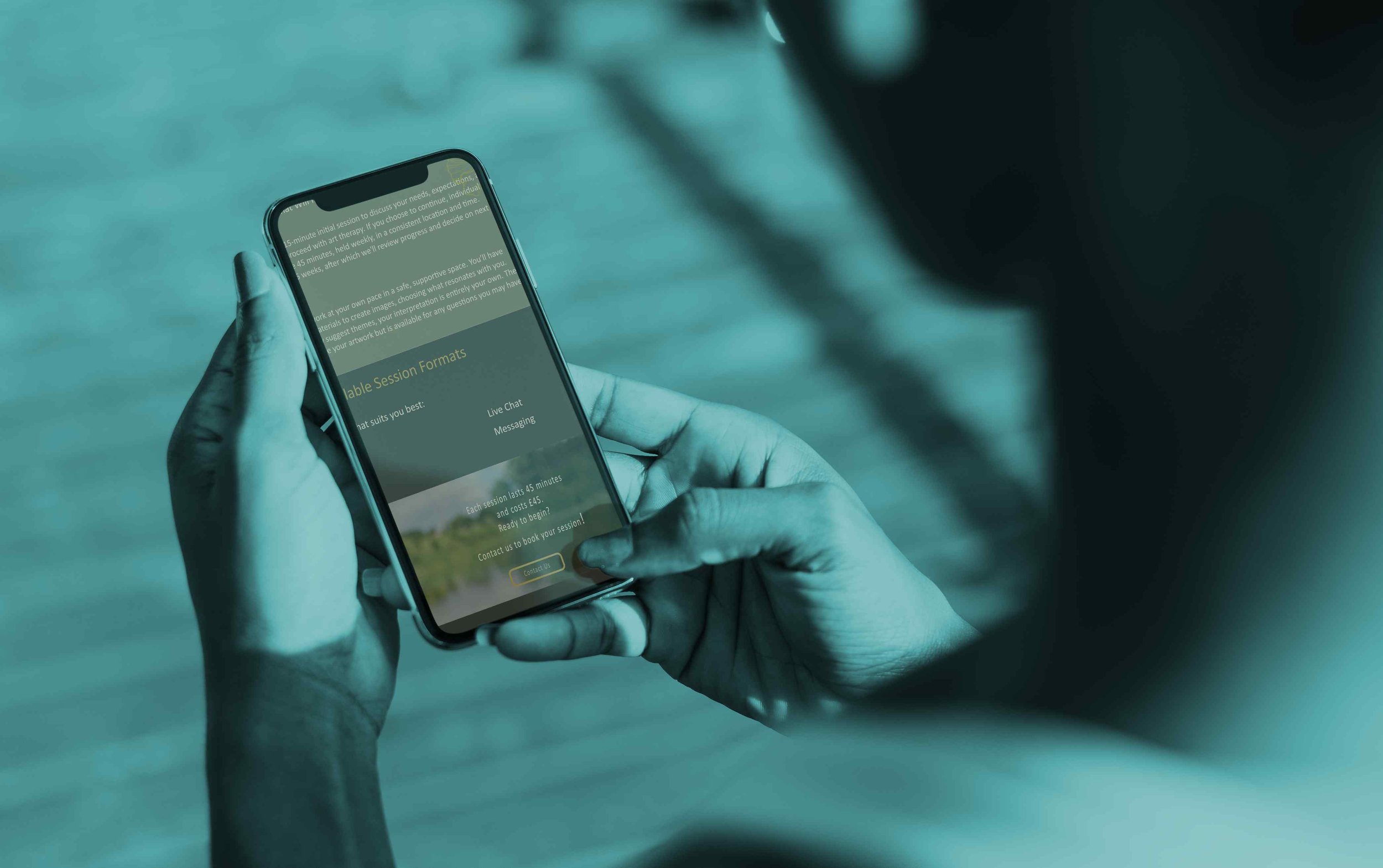
Website Design
In designing websites for my clients, I prioritize a user-centered approach, ensuring each site is visually engaging, easy to navigate, and fully functional. My process begins with understanding the client’s brand and target audience, allowing me to create designs that are both appealing and aligned with their vision. I focus on clean, intuitive layouts that guide users effortlessly, ensuring essential information is always easy to access. Each project combines aesthetics and practicality, combining appealing visuals with streamlined functionality to deliver an impactful and user-friendly digital experience.
Our Design Process
Initial Consultation: Once you reach out to us, we’ll schedule a meeting to discuss your design needs and vision.
Project Proposal: After our chat, we’ll create a proposal outlining the project scope, timeline, and costs for your review.
Creative Presentation: We’ll present a tailored design approach that aligns with your goals, showcasing concepts and ideas for your feedback.
Revisions & Refinements: Your input is key! We'll work together to make any necessary revisions to ensure the design is just right.
Final Delivery: We deliver the final project with precision, meeting deadlines and exceeding expectations.
For design inquiries or more information about services and pricing, please feel free to contact us!